FORTERRO
Forterro is viewed as an industry leader serving industrial SMEs around the globe with a series of specialized ERP companies. A few years ago, the Forterro team approached Hark to redesign their brand, as the company was rapidly growing and evolving into multiple unique brands. Hark developed 12 unique logos with a cohesive “line in the sand” theme. This year, Forterro again approached Hark as they changed their strategy to use a single, recognizable identity to reinforce that they are one company with multiple products.
Forterro had outgrown its original market position and brand identity through numerous acquisitions, new product offerings, and niche market accommodations that developed over years of constant growth.
To unite Forterro with its products, we developed a visual based on its four values. These values include driving impact, championing difference, achieving together and driving forward, all of which revolve around people at its core.
The new logo had to reflect Forterro’s ambition for growth and belief in never standing still. They are inspired by their customers’ needs and strive to do things better to reach the next milestone. They believe business is an adventure and we all have the power to move things forward.
POWERING THE BUSINESSES POWERING THE FUTURE™
Forterro prides itself on supporting industrial clients who manufacture and transport vital components for a better tomorrow. They strive to create a future where people are safer, businesses run more smoothly, and products reach their intended destination without delay. Every product they create strengthens and accelerates their clients’ ability to operate efficiently and remain competitive. As a result, Forterro helps thousands of customers streamline their manufacturing processes and delivery systems, enabling them to produce essential components that keep our world running and improve our lives.
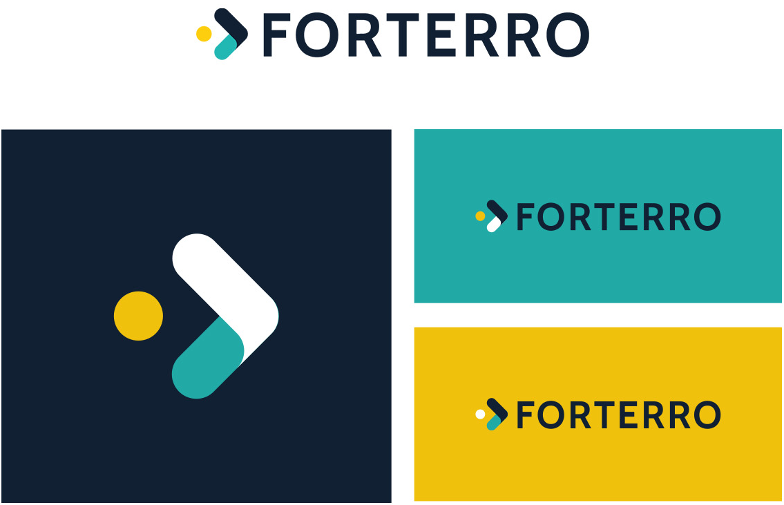
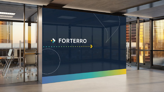
Hark created a new brand identity that reflects the mission of driving things forward.
“This is our one, single company brand that gives us one, single identity with which we will build consistent experiences for our people and in the market.”
Because Forterro is an international company with brands based out of France, Germany, Spain, Sweden, Switzerland, and Poland, we needed to design a logo that could span language barriers.
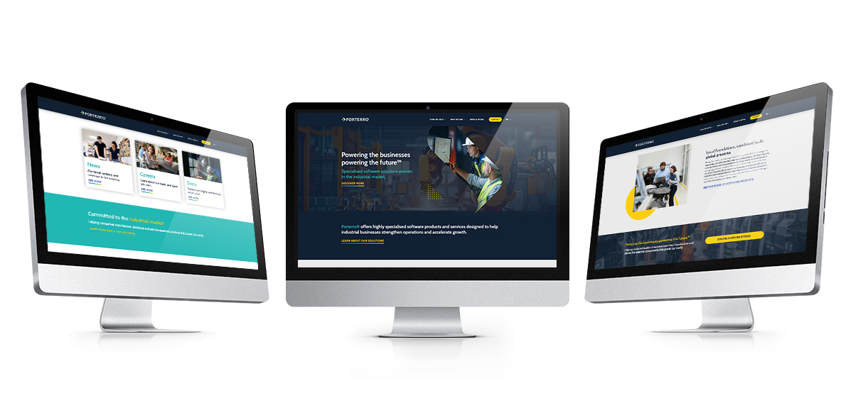
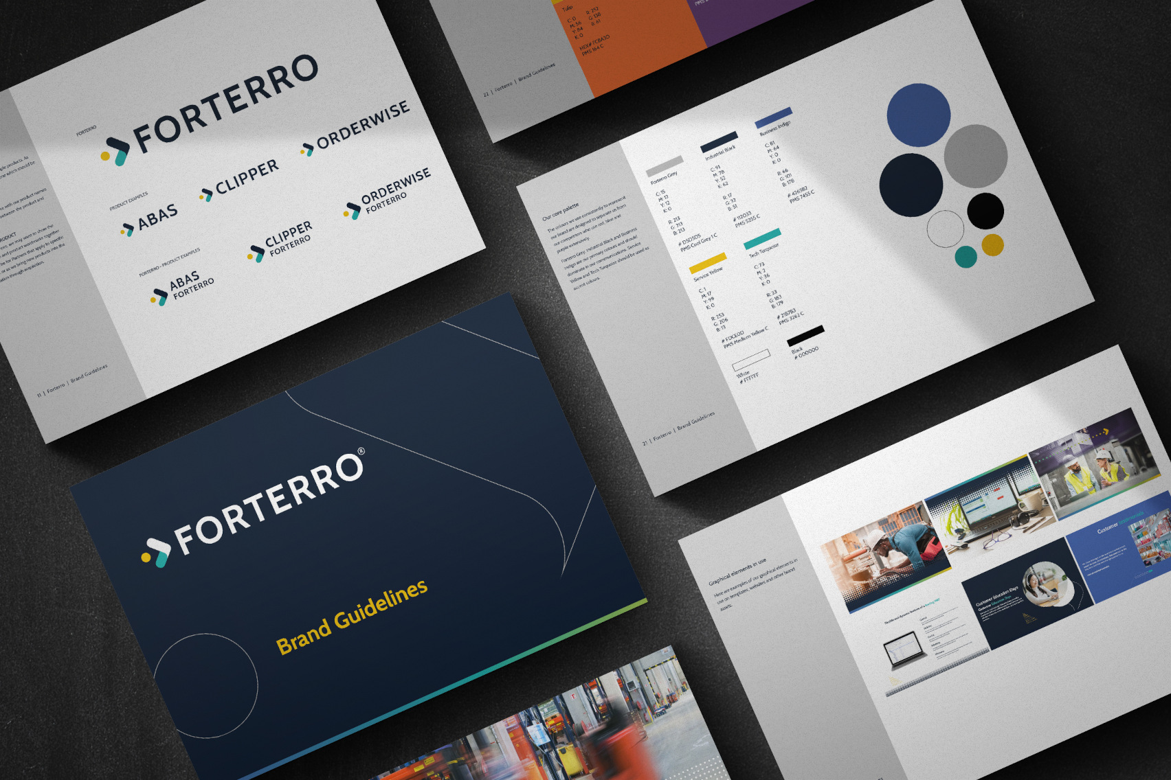
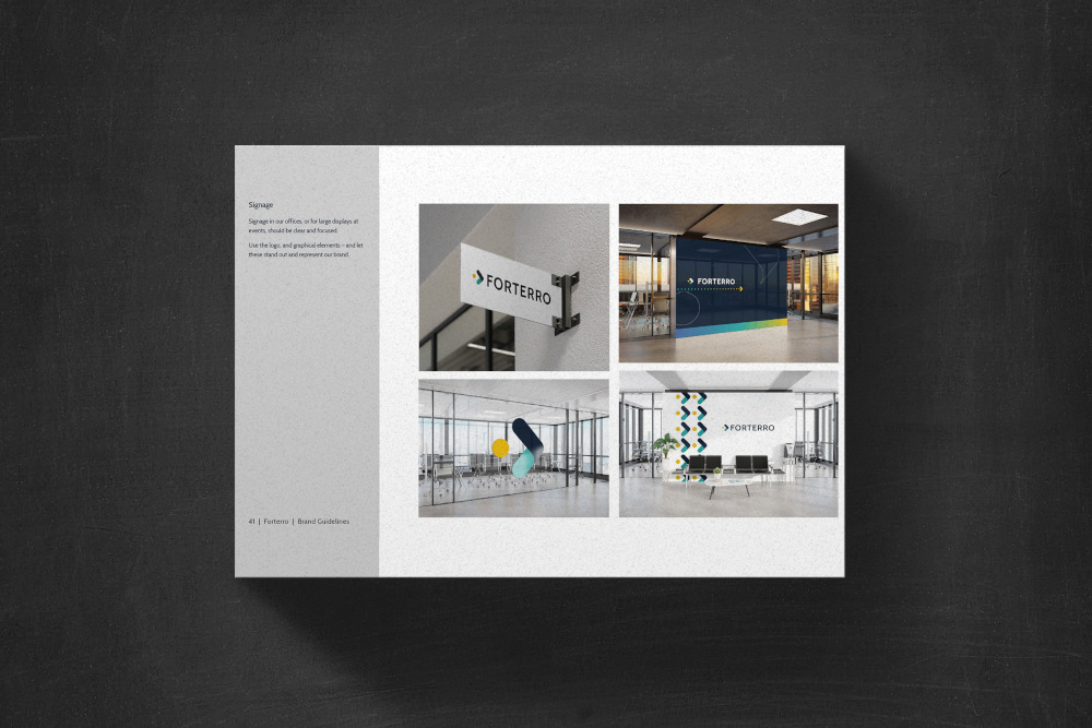
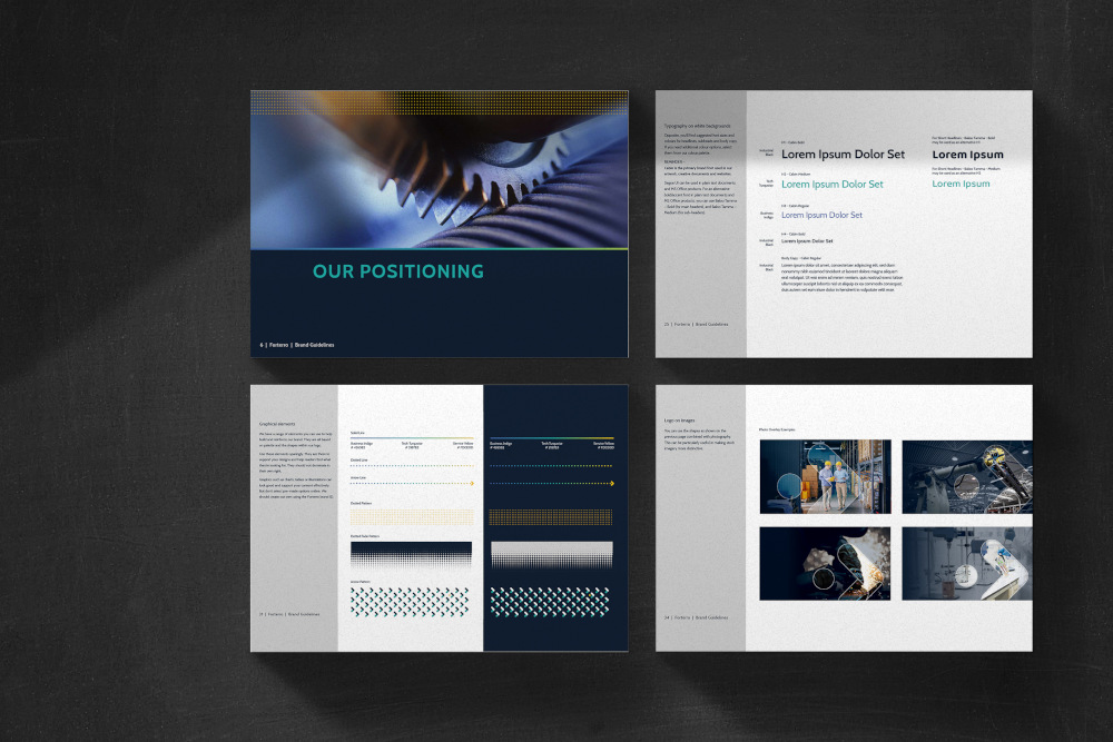
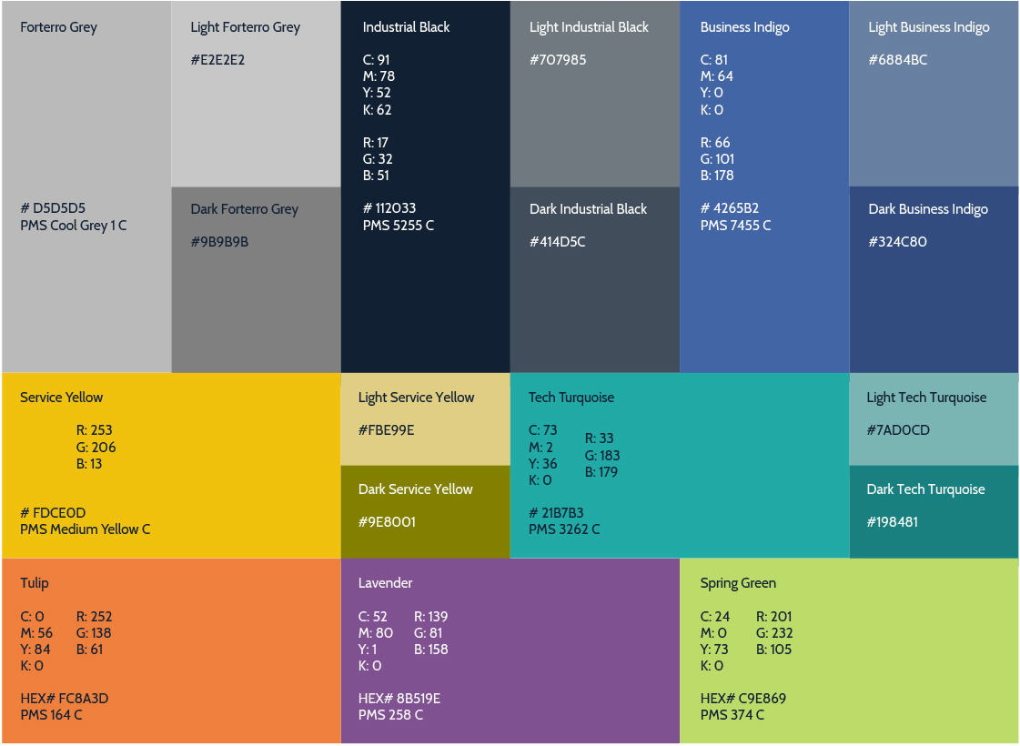
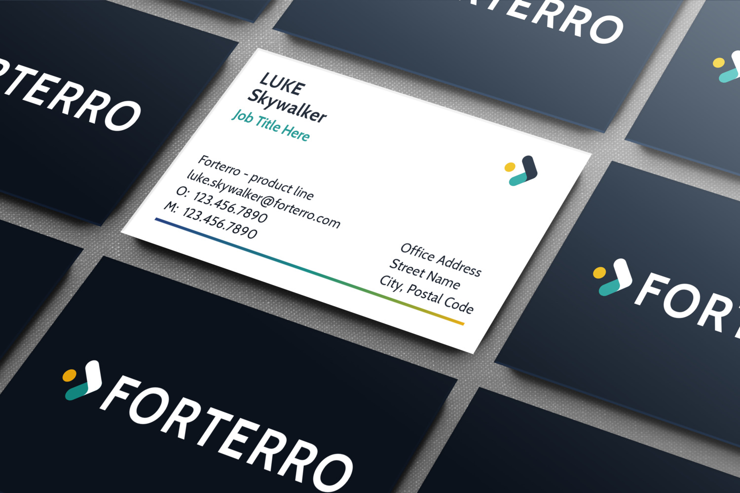
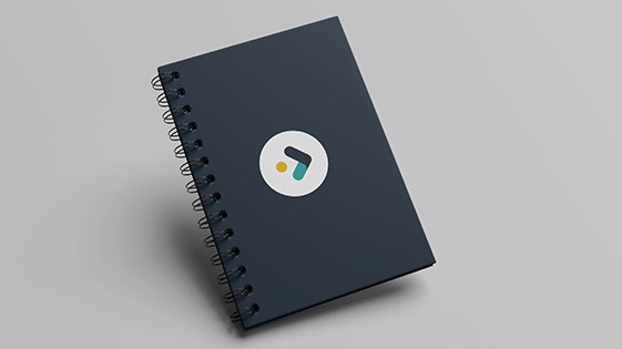
In addition to its new logo, Forterro received a comprehensive brand guide, business cards, web design, Microsoft reporting and presentation templates, building signage and brand merchandise design.
FINAL WORD
The Forterro project presented Hark with a challenge — to bring together 12 individual product identities under one recognizable brand. They had to speak their own messages, in their own languages, while also uniting the Forterro reputation at large. We successfully integrated the vision of each branch into a singular purpose, articulated beyond the barriers of language and culture.