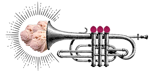
Sisters Of Anarchy
Bob and Becky came to us with an exciting goal: to bring their farm-to-cone, Vermont-made ice cream to the forefront of the industry, while also communicating their rebellious philosophy with an extra serving of attitude. We were psyched to help this spunky, women-led company spread their message across the nation. With cheeky, musically-inspired flavors like “Black Velvet,” “Purple Haze,” “I Really Love Your Peaches,” and their flagship “Chocolate Anarchy” (honestly, the best chocolate ice cream we’ve ever wrapped our spoons around,) Sisters of Anarchy had a loud voice and a kick-ass message that lit our creative fire. Along with a complete visual makeover, website redesign, and brand marketing discovery, we took Sisters of Anarchy to the next level – serving their irreverent wit to the internet, deliciously, with a cherry on top.


“Unlike most ice-cream companies, we don’t throw around ‘farm-to-cone’ just because it’s a catchy phrase. Our ice cream is, truly, farm-to-cone, made on-site at Fisher Brothers Farm in Vermont, almost entirely with flavor elements grown on the farm by the ice cream makers.”
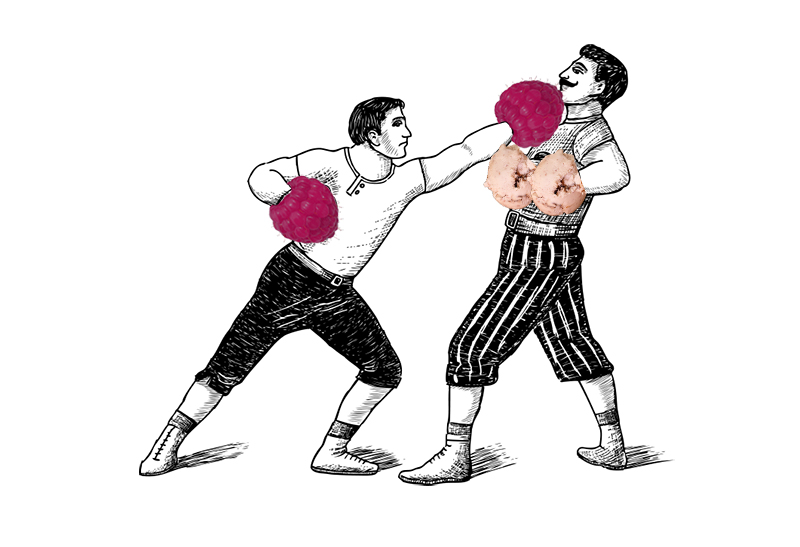
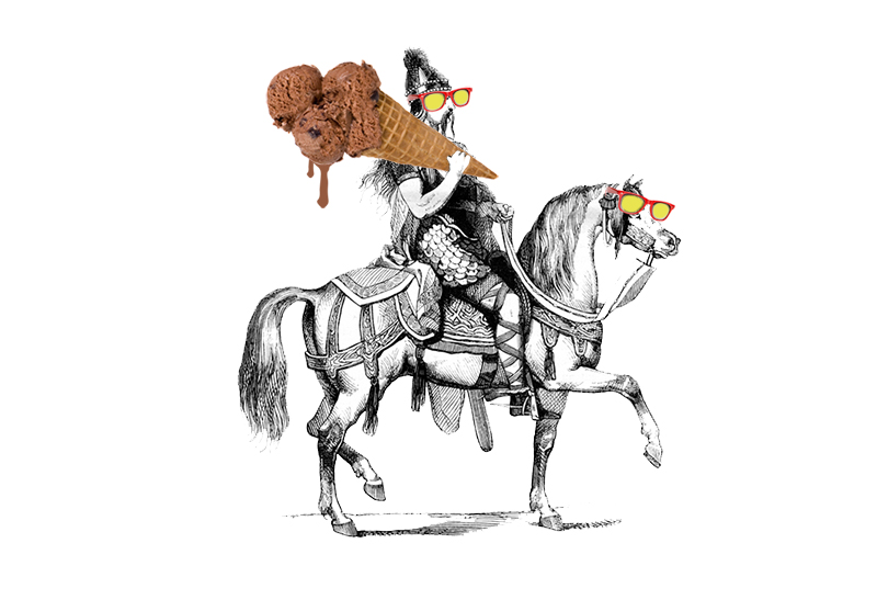
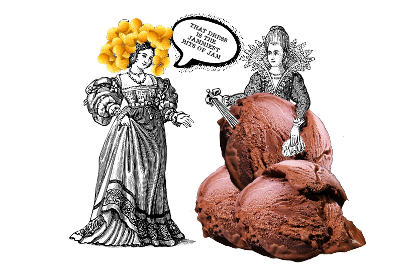
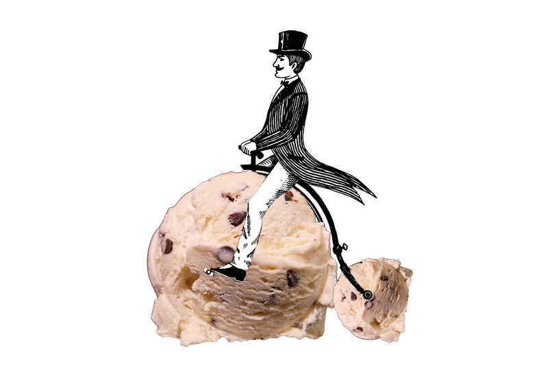
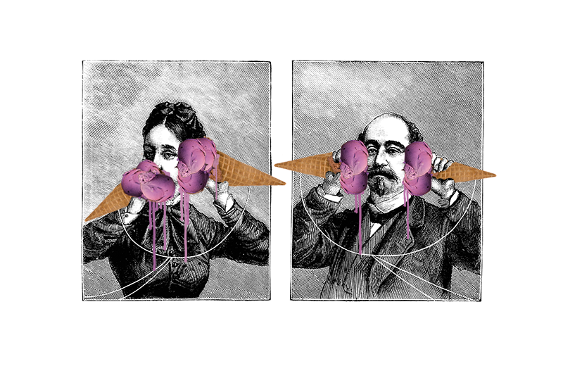
Our meetings with Bob, Becky, and the Sisters were always entertaining. Occasionally with the help of ice cream, we brainstormed through various iterations of design before nailing down a character that was uniquely their own. With a recipe that was one part goofy, two parts fierce, the message we uncovered was clear – Chaos is everywhere, eat dessert first.

Brand Identity – Born For Greatness
It was important from the beginning that Sisters of Anarchy would one day broadcast a clear, well-defined personality loud enough to echo through the mountains of their Vermont home. Lucky for us, this spunky family had plenty to say when asked what defined them.
“We could have named ourselves the Sisters of Perpetual Consistency, but that would be lame, and certainly untrue. Great women are not born for predictability—where is the fun in that? No, great women are born for greatness (duh), and we get up every morning and go to work with this thought uppermost in our minds.”
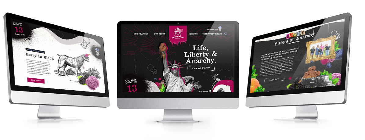
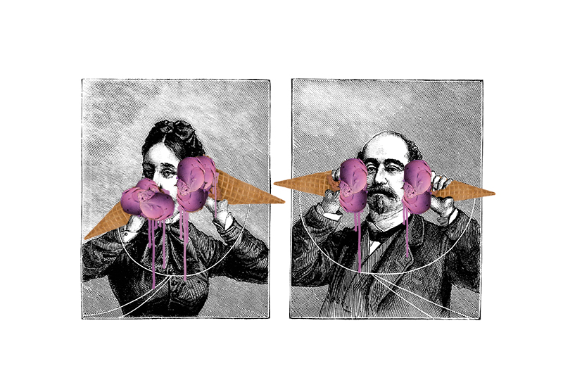
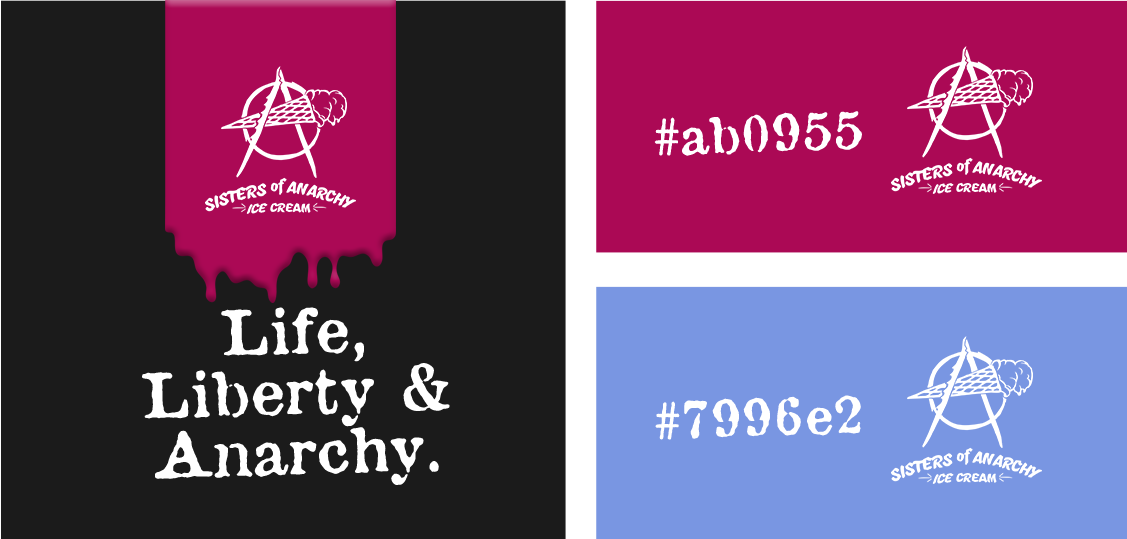
The theme of anarchy permeated the design process. The colors we chose for Sisters of Anarchy however were inspired by the beautiful natural pops of blue and magenta found across the farm. Set against the black backdrop that characterized their fierce medium, these pigments seemed to pack a flavorful punch.
E-Commerce
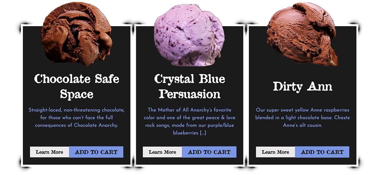
Boldly going where few ice creams had gone before, Sisters of Anarchy & Hark set out to build an online scoop shop where customers could mail-order fresh, homemade pints for delivery. Well-composed flavor profiles were key. With ingredients like aronia berry brownies, Marquette red wine, and ginger-chocolate-molasses cookie dough, the products really needed to speak for themselves. In catering to the needs of a readily-addicted consumer base, the online shop also features variety packs for chocoholics, berry lovers, and “The Soccer Mom Special,” including the flavors Nine to Five, Whiner, and Snap (coffee, wine, and cookies, respectively.) Of course, the ice cream shopping cart icon was a given.
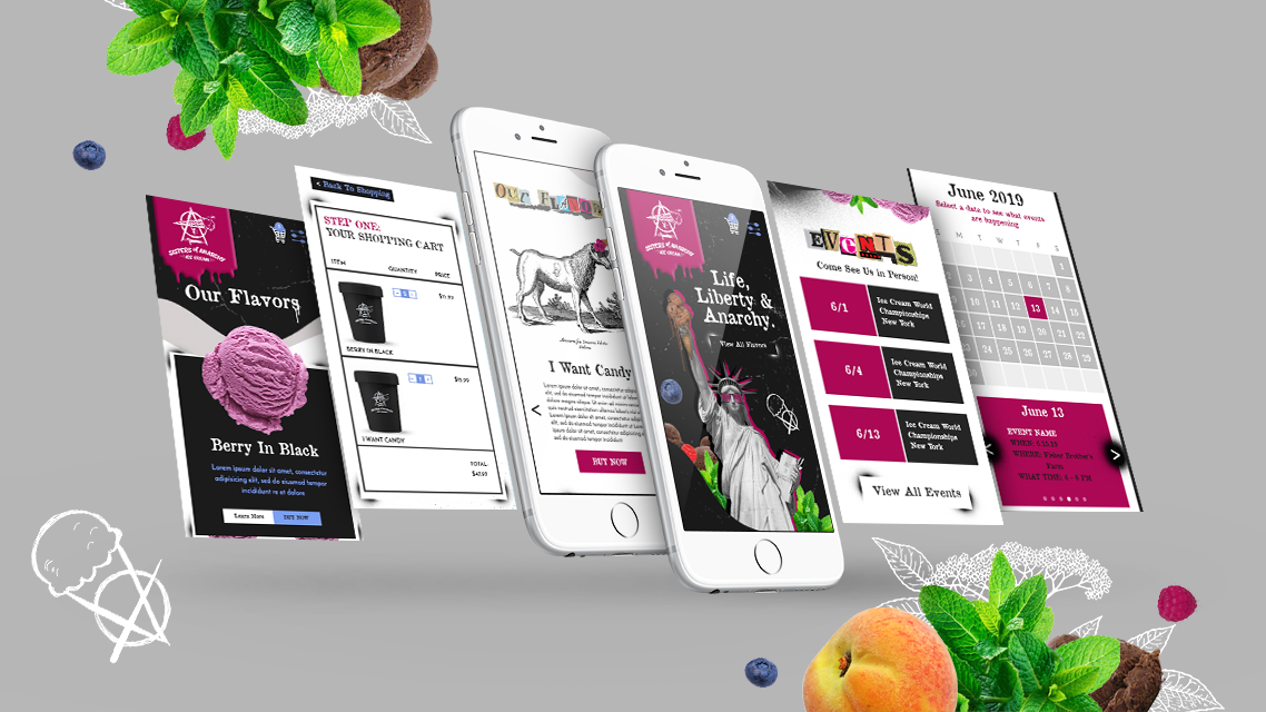
Mobile
Of course, we ensured that our beautiful website would translate to mobile users.
We wanted to make sure that our designs were fully optimized across platforms, securing consumers’ universal rights to ice cream for all.
“We are women. We are who we are. We do what we do. So eat dessert first, ‘cause you never know what might happen.”
– Sisters of Anarchy “Woman-ifesto”
Final Word
Post launch, we’re proud to say that Sisters of Anarchy now dominates the farm-to-cone industry landscape with a loud and proud website, social media presence, and digital marketing strategy that looks as good as it tastes. If you haven’t ordered a few pints of this ridiculously tasty ice cream yet, we highly recommend it.