IBM Plex and Why We Should Care More About Typefaces
Author: Francesca Genello
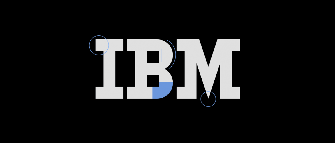
IBM has always been an iconic structure in the world of type. Having created the Seletric Typewriter with interchangeable fonts and it’s commission of the Courier typeface, it’s clear that type is something that IBM is passionate about. Last week, IBM said goodbye to the modernist Helvetica and released in beta their first bespoke typeface, IBM Plex. This new typeface is a huge step in their design legacy and will be used across all IBM platforms including software, websites, signage, business forms, and marketing initiatives.
All this talk about type had us thinking, when did this all start, what’s the design process, and why should we care?
People have been communicating since before language was even documented. But how did this communication get transferred to print? Well, you can thank Johannes Gutenberg, the inventor of the printing press. Way back in the day, we’re talking 15th century, he also created the very first typeface “Blackletter” which was modeled after the scribes.
However, the design of Blackletter looked great for the scribes but not so much as print – it was dense and squished together. Something needed to change – enter Roman typeface. Based on straight lines and regular curves, it allowed for print to appear more legible. Roman typeface quickly spread across Europe and sparked a trend of type innovation. Many fonts unfolded and kept a consistent usage until the second industrial revolution where advertising brought a new popularity and importance to typeface. In 1957, the creation of Helvetica with simple curves and many weights was introduced and quickly became as many would consider the “World’s favorite typeface”.
As technology evolved, computers allowed the creative transformation from pixelated unoriginal fonts to hundreds of thousands unique typefaces. With this many options and the ability to go from playful to modern and elegant fonts, it’s easy to take typefaces for granted. How often do we actually think about what goes into the making of the fonts we use daily? Maybe we should think about it more.
Creating fonts that are attractive and useful for a variety of platforms takes time, talent, and an unbelievable amount of patience. Visual aspects, including type, are one of the most viewed elements of your company. Well designed typography has the ability to grab attention, instill familiarity, and reinforce your message. So the typeface used on web and print design can define the whole vibe of your brand but it could also break it if you’re not paying attention.
IBM certainly payed attention. Their passion for good design was expressed when they put 100,000 employees through specific design training. The idea of an IBM typeface lingered for awhile until designer Mike Abbink joined the team in 2015. Abbink and his team spent two years designing IBM Plex and those long hours resulted in a delicate hybrid of engineered shapes with natural strokes from handwriting. “Plex is about finding the quirkiness between manmade things and engineered moments and bringing that into letterforms,” – Mike Abbink.
Interested in using this font yourself? You can download it from GitHub – however IBM Plex is still in development, a more stable version will be available everywhere, for free, come January 2018.
Want to learn more about how Hark can help?